• (Updated )
Site Update: More glass-cards!

It has been a long time when we reintroduced glass-cards on our website. They are timeless, representing these four different eras of user interface design:
- Modern version of the Flat Design, full with cards and rounded corners,
- Windows 95-era aesthetics,
- Fictional-yet-futuristic UIs, like Augmented UI,
- and glassmorphism. We started on experimenting these cards before glassmorphism was even a trend.
We are first proud to introduce this as far as in 2019, before 2021, and late 2023, where we made it the foundation of our design system.

And now, there’s a new kind of glass-cards available on our website: tables! Before, we do not have proper styling, so tables on our website didn’t have borders at all. But now we have, and with a special highlight effect on it.

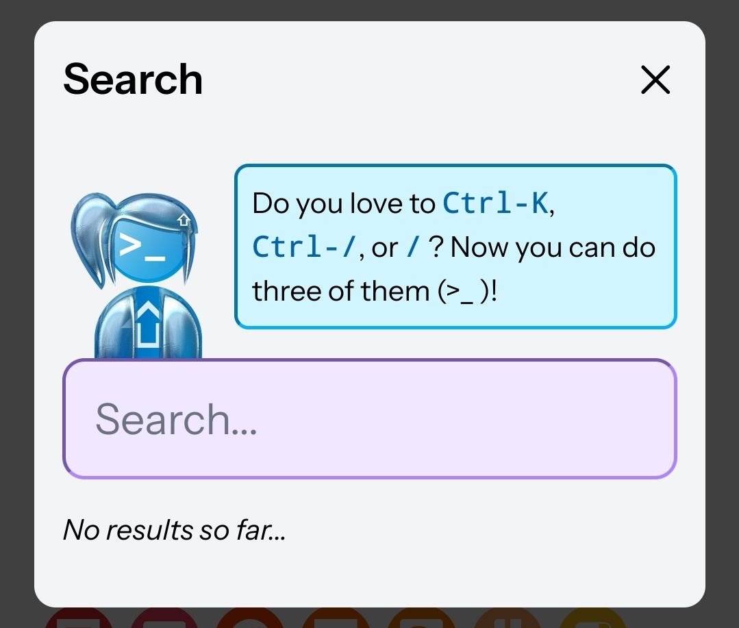
There are not much other news to share, but we really wanted to bring back this old effect to our new website. Both sites are also powered by Highlight.js, making it technically possible for us to reimplement this cool effect:

And lastly, you can see that our blog posts become more colorful, as monospaced text (and commonly used for inline code snippets) are now highlighted "blue", alongside violet for links and magenta for bold. We have also optimized the contrast of these colors in the dark mode, making blog posts as attractive on dark mode as in light.

So, what’s next? We’ve silently teasing a new logo for Shift and Shiftine based on a new character system that’s modular, allowing anyone to remix the assets, and we can’t wait to have these new ones on our websites.

And lastly, we are currently in progress for tagging accessibility-friendly articles, which contains the necessary alternative text for images (including this post). We are planning to show such labels on our site to encourage ourselves to improve such accessibility!
