Blog posts from Logs of the SYSTEM (system)
Being concise and consistent with “and”.
Well, what could be wrong with the word “and”? Let's look at this example. Box A is full of red candies, while Box B is full of blue candies. Austin mixed all of these contents back into Box A, so we can now say it's full of red and blue candies. In programming, red and blue candies should have been the type of candy where both colors are present in every candy contained inside the box. However, they're are not! Instead, we have some all-red candies and some all-blue candies. So we should say Box A to have red OR blue candies, or specifically, red XOR blue candies. There’s a lot of English sentences which uses the word AND like this. However, a lot of us misunderstood it, as we, robots, prefer to designate them as XOR instead. Here's some other real-life examples: What people saidWhat is should have been for usExplanationAustin mixed all of these contents back into Box A, so we can now say it's full of red AND blue candies.Austin mixed all of these contents back into Box A, so we can now say it's full of red XOR blue candies.Each candy is either blue, red, but not both colors.By visiting AND/OR using our services, you agree to our Terms of Use and Privacy Policy.By visiting OR using our services, you agree to our Terms of Use and Privacy Policy.The term AND here is already a subset of OR, so it's redundant for both written on legal documents.So, do you want the blue dress OR the red one?So, do you want the blue dress XOR the red one?Either blue or red, but not both. Remember that you can only choose one in most cases. Looking from a different perspective. So far, we’re just looking at the intrinsic values of Box A, which is, the extrinsic values for each of the candies. Remember that, in Box A, we evaluate how each of the candies look from the inside of the box, but still outside of the internals of these sweety objects. Or in other terms, we called it as XOR because we’re looking at the exterior of these candies, through the interior of the box. However, if we assume that the box itself is transparent, then shift our perspective to to see the transparent exterior of the box itself, we could consider it to be an AND instead because from the outside, the box contains both blue and red colors, despite the ones who have these colors are the candies themselves. Humans often use the distributive properties of these language conjunctions. Instead of confusing people with “blue AND red candies”, and even “blue XOR red candies”, we could have said them as “blue candies AND red candies”. This is because from the box's exterior point of view, the box has both blue-colored candies and red-colored candies. But again, for the sake of simplicity, they often choose to simplify them as “blue AND red candies”. So, what does these all mean? Starting today, we will start to introduce the word “and”, “or”, and “xor” on our official documentation. Sorry, I mean, “and”, “or”, xor “xor”, because we don’t really force all of these three terms to be included on every page of our documentation. This means that the word “or” should be interpreted as the same as “and/or” (the inclusive “or”), as commonly found in legal documents. These changes will apply into our documentation and blog posts, except for legal documents and contracts as they require the use of standard legal words.
NOTICE: MacBook factory reset on March 4 to 7, 2024.
On Monday, March 4 to Wednesday, March 7, Reinhart will perform a factory reset to his MacBook Air (reinhart-pc3) to reinstall necessary development tools and remove older projects. Sorry for the inconvenience.
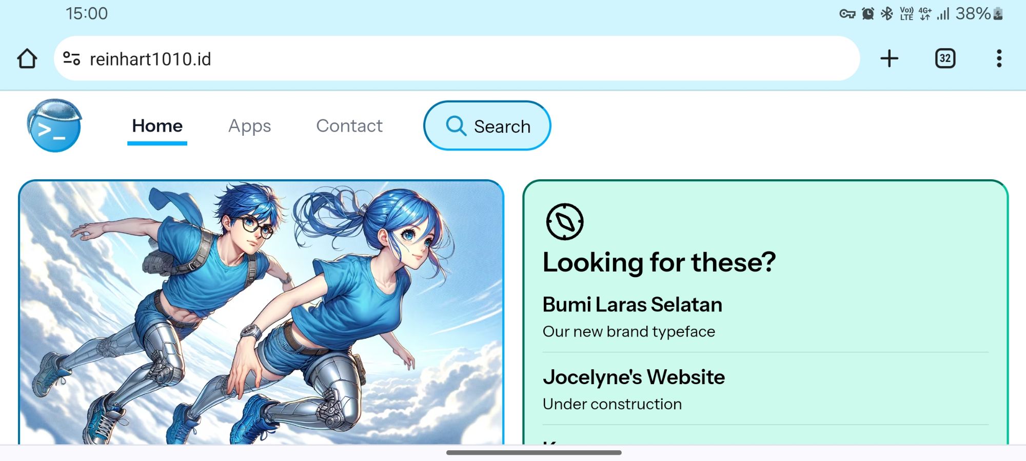
Site Update: Announcing our new typeface, Bumi Laras Selatan.

Site Update: Now with new color palettes!
Earlier this year, we have discussed a new set of color palette, then refreshed it, which someday could become an integral part of our brand. These palettes are so versatile enough that we have been confident over this entire year to produce artworks, campaign media, and even apps exclusively relying to these limited set of colors. And making the palette programmatically with OkLCH allows us to accurately reproduce the kind of color shades we wanted for every color spectrum. But there were two main problems that we faced sooner: Itʼs difficult to reproduce colors which are optimized for user interface backgrounds. Sure, we can use either Galih-Ratna or Dilan-Milea for buttons and links, but these colors were not designed for background elements such as cards. There is no standard grey color shade. Or brown. Grey is significant in user interface design for neutral or disabled buttons and other interactive elements. So today, we are excited to announce a new color palette series: Rangga-Cinta, from the Indonesian record-breaking Ada Apa dengan Cinta? movie. These muted color sets are meant to complement the vibrancy prepresented by both Dilan-Milea and Galih-Ratna, and in fact, we are already using these on our reinhart1010.id website. Because of their nature of muted colors, the Rangga-Cinta version of Blue can be considered as the official version of our Gray. And they have generated some cool brown-like shades for use, too. Improving the consistency and interoperability between Dilan-Milea, Galih-Ratna, and Rangga-Cinta. We have also slightly tweak the Galih-Ratna color sets, so now Dilan-Milea 500 color scale is exactly the same with Galih-Ratna 500. Similarly, Galih-Ratna 50 also becomes the basis of Rangga-Cinta 50, and Dilan-Milea 950 is essentially the same as Rangga-Cinta 950. This has some technical benefits to our main website, which is currently based on Tailwind CSS. Before, we had assigned different colors for these glass card borders and background, not to mention the colored shadows and hover/active shades. These took a whopping 20 CSS color-related classes to render a single search bar! bg-gr-fuchsia-50/50 dark:bg-dm-fuchsia-900/50 focus:bg-gr-fuchsia-50 dark:focus:bg-gr-fuchsia-900 hover:bg-gr-fuchsia-50 dark:hover:bg-gr-fuchsia-900 text-gr-fuchsia-900 dark:text-white placeholder:text-gr-fuchsia-600 dark:placeholder:text-gr-fuchsia-100 border-gr-fuchsia-500 dark:border-dm-fuchsia-50 focus:border-gr-fuchsia-500 focus:dark:border-dm-fuchsia-50 shadow-dm-fuchsia-500/50 dark:shadow-dm-fuchsia-200/50 focus:shadow-dm-fuchsia-200/75 dark:focus:shadow-dm-fuchsia-200/75 hover:shadow-dm-fuchsia-200/75 dark:hover:shadow-dm-fuchsia-200/75 Now, by using these color synonyms, we can remove most of duplicate color classes (including colored placeholder texts in favor of standard grey ones) into just five! bg-rc-violet-50 dark:bg-rc-violet-900 hover:bg-white dark:hover:bg-dm-violet-800 border-dm-violet-300 Coming soon: A standard for applying colors. Well, as promised earlier, we are still going to announce new updates throughout this holiday season. But at the meantime, we are also still in the works of standardizing how these colors should be used. You may also notice that weʼve implemented dynamic theming on different webpages under the same site. Itʼs just another part of standardization that are taking place here. In the future, we will eventually standardize color schemes for form controls and so. But thatʼs all for now!
Site Update: The new homepage that never was.
Why I don’t care about surveillance capitalism anymore.

@1010bots, coming soon to OpenStreetMap

Submitting Every Door v4.1 to HUAWEI AppGallery.
As a followup to our previous announcement, we’re submitting a brand new version of Every Door to HUAWEI AppGallery with the following fixes: Fixed capitalization for descriptions. Fixed yellow amenity warnings not shown. Fixed marking a shop on a building disused. We are aware that this app might not be available in India and other countries, so we are rechecking the cause behind these issues, and hope that this will be resolved soon.
Site Update: Search and print-friendly page formats!
